IR Sunflowers

Michael13

Moderator
Rasmussen Farms near Hood River, Oregon used to have a special event each August honoring sunflowers. I say used to, because the farm changed owners a few years back and no longer does this. It was a great excuse for Portlanders to take a road trip out to the country, buy some fresh produce, inhale some clean country air, and see a huge variety of different types of sunflowers. I miss this event so much! If anyone knows of a great sunflower location that is happening this summer in the pNW, please let me know and I'll be there.

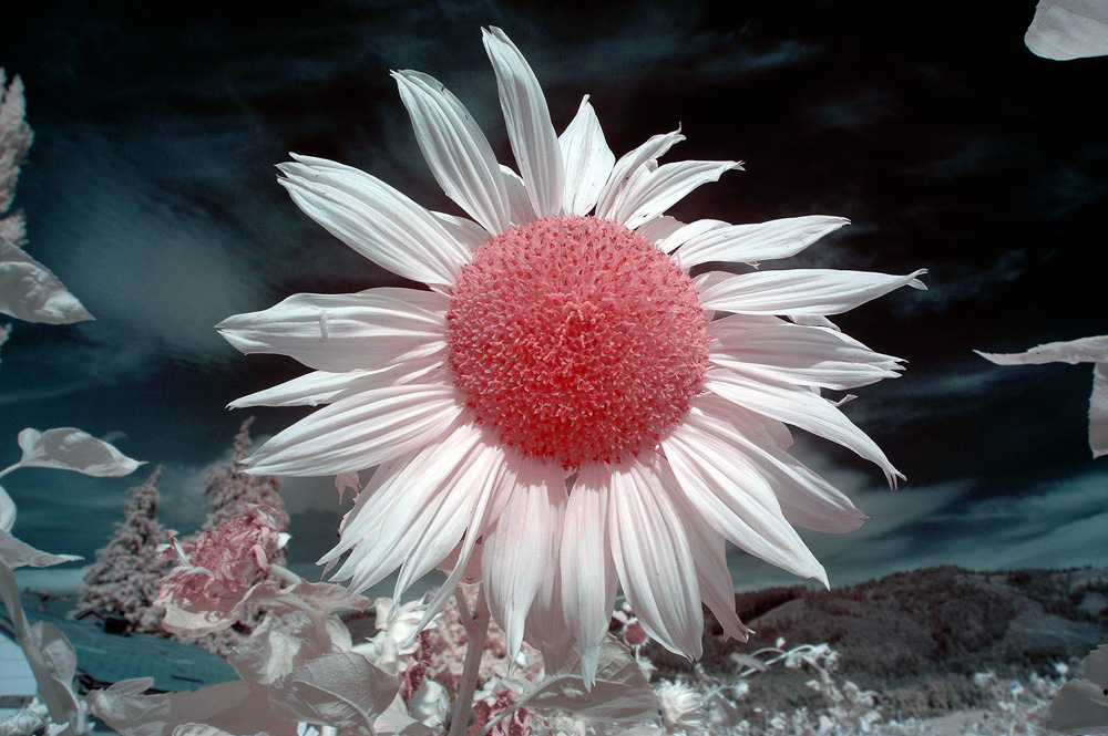
First image is with a 720nm conversion, second image with a 665nm.
0232R.jpg
0024XSH.jpg
 

AlanLichty

Moderator
I haven't seen a lot out of the 665nm wavelength range and what you have posted has me kind of curious - that is a very different palette from what I used to working with in either 590nm or 720nm.

I wish I had known about the sunflower farm while it was still active - that would have been a fun day trip. Hood River has some nice places for lunch too.
 

Michael13

Moderator
@ Alex - first I had my WB dialed in on that camera, that's most important. From there, the flower captured was a dirty red, so I went in hue/saturation and made the adjustment, then added a bit of contrast.

@ Alan I loved the 665nm conversion and got very comfortable processing it to my liking. But with the advent of full frame bodies, the ability to set a CWB with infrared went away (at least it did with Nikons). You can somewhat mitigate this with a custom profile in photoshop, but I was never able to get the results I wanted so nowadays I shoot only B+W IR with an 850 conversion. But I truly miss the pre-full frame days when I set a CWB on green grass in direct sunlight and get predictable results every time.
 

JimFox

Moderator
Staff member
Hey Michael,

I love sunflowers in IR. That's a combination that works so well. It's pretty cool seeing the differences between the different IR filters. #2 comes across with almost a surreal feel to it, perhaps from the golden centers of the flowers. #1 is neat in that it almost has a 3D feel to it. And I like that orange/red tone to the center. Have you thought about using Content Aware fill on the edges of #1? As great as #1 is, I think cleaning up the edges on the left and right would really take it to another level.
 
Top Bottom