Flying Dragon SH2-114 (opinion needed please)

Comet Hunter

Supporting Member
OK, I need everyone's opinion
Do you like the Red Dragon on the right or number 2 in the middle or nether? please advise what you would do different?
And for those who have never seen or processed a raw astro image. #3 is what I started out with (so many stars)
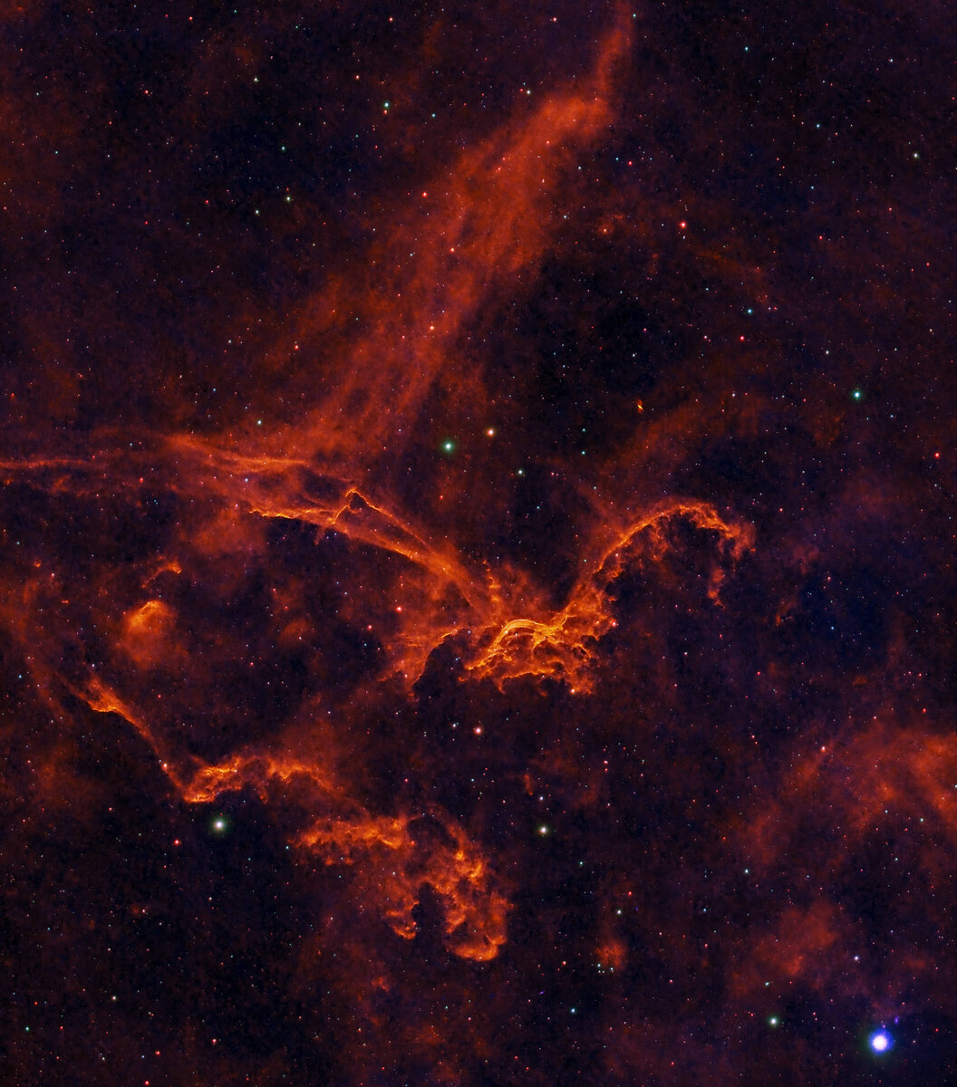
SH2_144_SV_26_Tri_Red_2023_rev3.1.jpg
SH2_144_SV_26_Tri_2023.jpg
raw_dragon_master.1.jpg
 

JimFox

Moderator
Staff member
Hey Ed,

I like that you posted the original too. We have people who don't do astro viewing these, so I think it's nice to let them see what we are starting with sometimes.

This is another section I haven't captured yet. So it's great to see it first off. It's pretty cool looking.

I think #2 is too dark. #1 is bright enough, but too saturated. So for me, I would take #1, but back off on the saturation. There are some blown reds, and also the background is blue, but it should come across as black not blue.
 

Comet Hunter

Supporting Member
Hey Ed,

I like that you posted the original too. We have people who don't do astro viewing these, so I think it's nice to let them see what we are starting with sometimes.

This is another section I haven't captured yet. So it's great to see it first off. It's pretty cool looking.

I think #2 is too dark. #1 is bright enough, but too saturated. So for me, I would take #1, but back off on the saturation. There are some blown reds, and also the background is blue, but it should come across as black not blue.
perfict, just what i was looking for.... thx
 

AlanLichty

Moderator
Wow - that's a lot of recovery work. I am just used to seeing your final results. I am kind of partial to the first image but I am one of those non-astro guys who just enjoy the deep space color shows after someone else does all the work :)
 

Mike Lewis

Staff Member
Interestingly I think I echo Jim's comments. I like the colors of #1, but it is overly hot - maybe stretched a little far and/or too saturated. #2 looks like you left some faint details clipped so it could likely be pushed more, but I do not like the 'palette' as much as #1. And as also mentioned above, it is nice to show where these images start from, as there is a LOT that has to go into making a wonderful final result as you are showing here.

ML
 
Top Bottom