Comet Hunter
Supporting Member
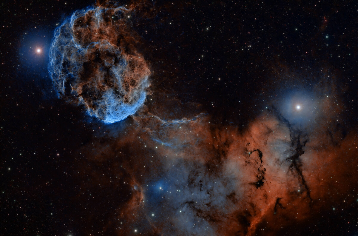
about 14 1/2 hours of 5 min subs. I could not make up my mind which I liked better?
What's your opinion? THe bluish one or the gold one?
Goes to show you how slight processing changes can completely change the image.

What's your opinion? THe bluish one or the gold one?
Goes to show you how slight processing changes can completely change the image.