Marsh's Edge

Amy Earl

Well-Known Member
Another photo from the misty day walk. I've been drawn to the interesting shapes of these branches at the water's edge. This worked pretty well in color because there are green and red tones in the foliage (plus the mist stands out more), but I ended up preferring this B&W version. What do you think? I'll post the color version a little later in this thread so as not to steal the thunder from this one right away.
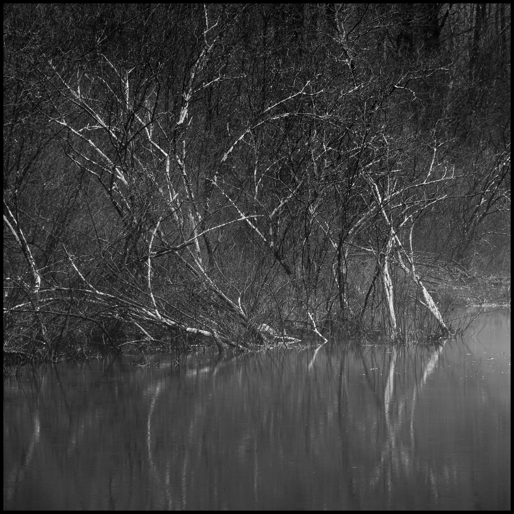
20201126_IMG_5991-Edit_AmyEarl.jpg
 

AlanLichty

Moderator
Interesting shapes but it doesn't quite pull me into the scene. I will be curious to see the color version.
 

Jameel Hyder

Moderator
Staff member
Nice location and you have some interesting shapes to play with. With b&w try a stronger contrast with separation of whites and blacks.
 

JimFox

Moderator
Staff member
I like the shapes too Amy, and B&W looks great here. I would suggest cropping a bit off the left side to lose that last vertical kind of branch that's closer to the edge. It's acting a frame on that left side and grabbing the eye I think.
 

Amy Earl

Well-Known Member
Thanks all! @Jameel Hyder I liked your suggest to increase contrast so I tried that and ended up going for a different crop.
@JimFox I did try losing that left branch but somehow I couldn't make the composition work. There's a beaver mound to the right that I didn't want to let into view so I have limited play room. Curious to hear if you all think this version is an improvement.

20201126_IMG_5991-Edit-2_AmyEarl.jpg
 

Amy Earl

Well-Known Member
In color you can see the mist better and so I didn't go hard on the contrast. I like how it's understated and how the forest is colorful but fading into the mist. Now that Jim mentioned that left branch I'm wondering if a tighter crop could work after all...but I still think I like this as is.

20201126_IMG_5991-Edit-3_AmyEarl.jpg
 

Amy Earl

Well-Known Member
Ok, I cropped out the left branch and I like it. Here are both b&w and color versions, and I figured out how to display them at a smaller size which I feel is a better presentation for this kind of photo. Thoughts?

20201126_IMG_5991_AmyEarl-3.jpg


20201126_IMG_5991_AmyEarl-4.jpg
 

AlanLichty

Moderator
I like the color versions much better and especially the last color version with the crop. I like the improved delineation between the trunks and the bare branches behind with the color as it looks less busy than the B&W at least for my eyes.
 

Jim Dockery

Well-Known Member
I prefer the original color version - I like seeing into the background forest a bit in the upper part of the picture. You are right on the mist being more apparent in color. The only thing I might try would be to slightly increase red and orange saturation to bring out the nice background brush, although I do like the subtle view here too.
 

Amy Earl

Well-Known Member
Thanks all.

@Jim Dockery I appreciate your suggestion because I think I also prefer that first color one for the same reasons - that bit of forest showing and the mist being more visible. It looks like I also kept more red/purple tones as opposed to the orangey look of the 2nd color version, and that seems to work better. I'll try adding a bit of saturation like you suggested and see if I can crop the left branch out without losing the forest in the upper right.
 

JimFox

Moderator
Staff member
Hey Amy, nice additional work here. I agree with Jim on keeping the top, but I definitely like the left edge so much better now. How about taking off from the bottom instead of the top when you crop off the left?

Both color and B&W are looking great, I don't think there is a wrong choice there. I think I prefer the B&W look because it then focuses the eyes more on the bare trunks.
 
Top Bottom