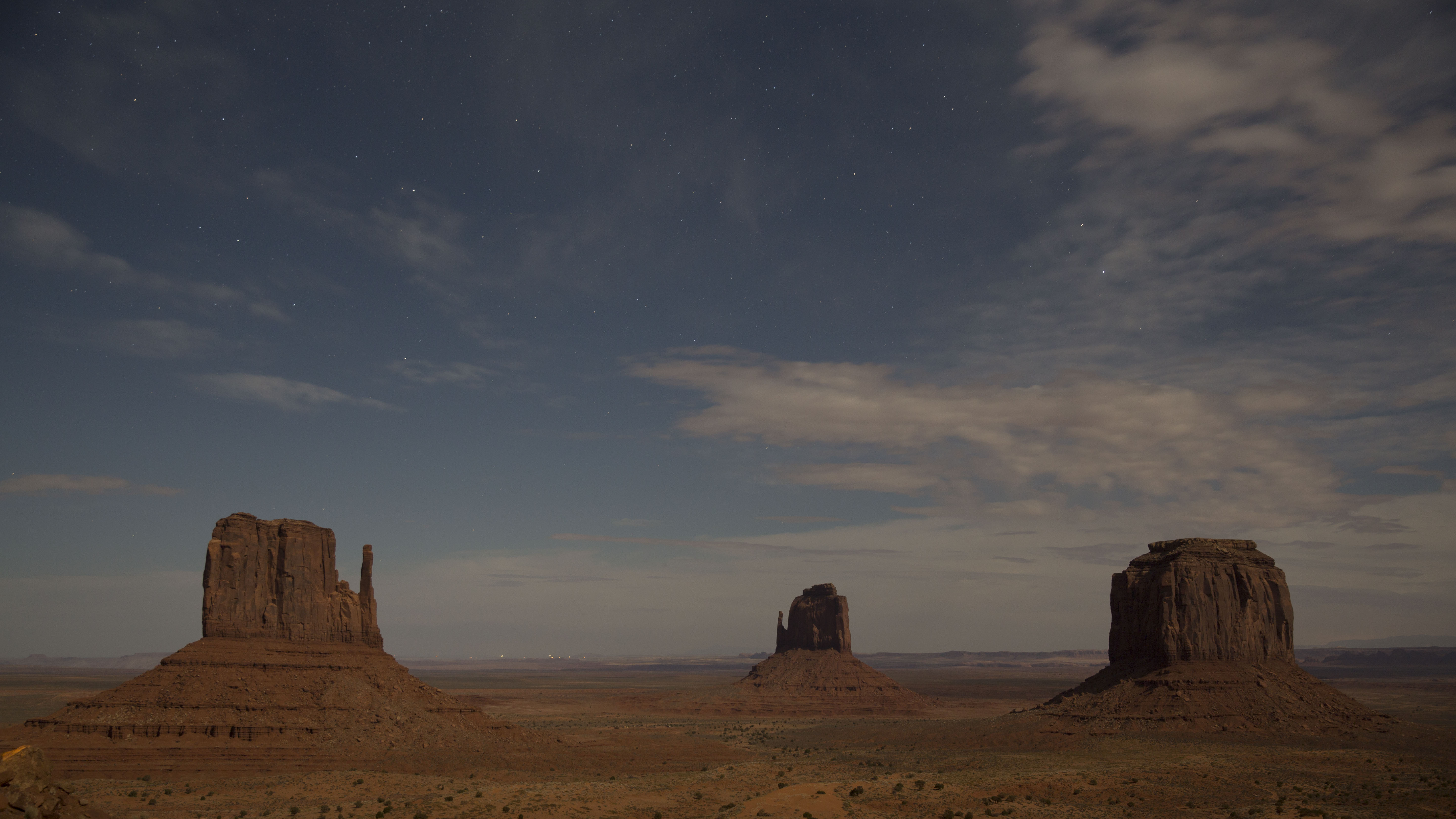
Time for my weekly moonlit Icon. I have applied the comments from previous weeks into this one and show the results first and a non altered jpg. Feel free to download and work either image.
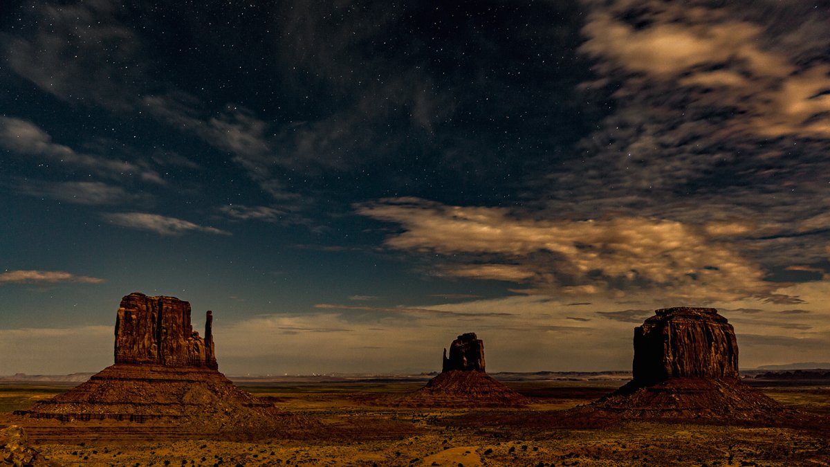


 Each one of these I do I wish I had shot with a darker moon. a usual, it's hard to get the stars to pop with a reduced size JPG, but your conversions says a lot about what tones and contrast you would prefer. That is very helpful.
Thanks Kyle, yes, I am a fan of westerns, and especially the many John Ford westerns that were shot in monument valley. I am probably heavily influenced by the old film look.I enjoy these Ben. I am definitely taking the approach of "here's what I would do" rather than trying to pick at your conversion. I feel like night shots, even more than daytime photos, really depend on the vision of the person that creates them. We're trying to capture an image that can't been seen with the human eye, so there is no objective reality to baseline against. I like seeing your interpretations (and those of others on the board) and if mine give you some ideas then that's good too.
Your take gives me an old west vibe which is cool. I'd have never thought to go that way - maybe in part because I've never been there. It is worth exploring partial moon phases and knowing where dense groups of stars are likely to appear.

Ok Jim, this is a full size 5300 wide 300dpi JPGHey Ben,
I had a thought. Perhaps we set up a Gallery just for Critique downloads? So anyone who wants to go edit the Critique Photo, can go to that Gallery and download the larger photo.
I just set that up, and it seems okay. So go to the Gallery and the Critique Download Category. Post the photo there and then upload it into here. Also, I would recommend uploading a larger pix, but also 300 dpi instead of 72 perhaps? I think we need to see what works best.
Jim
Jeffrey, this is outstanding. I love the colors the saturation and the detail. John Ford would approve.Hi Ben, thanks for letting me play with your fine image capture. I was going for a process that would emphasize the 'night time' look and show stars and saturated colors, but remain somewhat dark. Or else it would look like a daytime capture. I hope you like it.
View attachment 2450