Newly created image of the Milky Way at the Maze overlook (plus edit + one more)

Ben Egbert

Forum Helper
Staff member
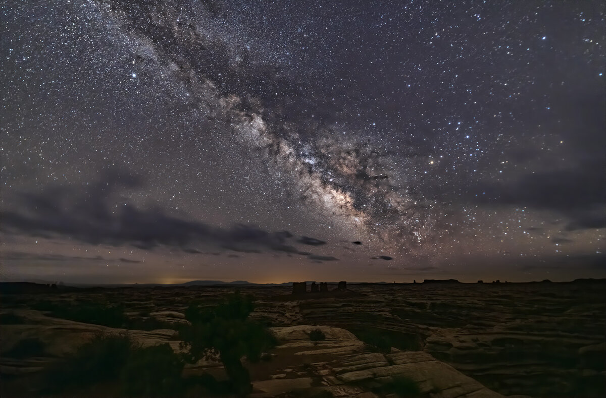
This is basically the same image I have been working for the last two weeks. I have learned a few things and put it all together into this image.

First I used the stack method to get better noise for the foreground areas. Then I processed the image from the stack with the best Milky Way as a stand alone image and blended the two. I left the foreground a bit darker in this image, after all it could not even be seen with the naked eye.

The one thing I am uncertain about is the color. I would like any and all comments regarding any aspect of this image, but especially the sky colors.

210415-22213-R5 stack blend.jpg


Brightened and cooled per suggestions.

210415-22213-R5 stack blend A.jpg


Here is a rework to reduce purple. I used color levels and reduced magenta and red slightly. Not easy to find the right combination the difference is subtle
210415-22213-R5 stack blend A1.jpg
 
Last edited:

JimFox

Moderator
Staff member
This is a great improvement over your first go at it Ben. I could see the ground layer just a bit brighter. Maybe our eyes see differently, but I would bet that if you let your eyes get accustomed to the dark they would see the ground layer as somewhat lighter. It takes nothing to mess up our night vision, just one simple look into our cameras or our back display and your night vision is messed up for a good 5 to 10 minutes.

I think the sky is too brown, I would cool it off more. It doesn't have to be pure blue, but I think a bit of a blue cast looks nice. It also should be brighter. You are tending towards making your night images too dark, that includes the sky. I know it can be a personal preference, so I get that. But I will say that your stars are not bright enough. Some of them are masked by clouds, but the ones that aren't should be brighter.
 

AlanLichty

Moderator
I be liking this one a lot. You did a good job of absorbing all the suggestions and producing this result. I do agree with Jim on cooling the sky tint a bit.
 

Ben Egbert

Forum Helper
Staff member
PS. This may have been a good candidate for the Critique Forum. :)
Thanks Jim, like you say, a lot of it is taste, I see a lot of Milky Way shots that are way too bright. I used your technique to brighten the stars and darken the sky. I also used a curve layer I learned on a tutorial to further tweak the sky. The ground layer could be brighter as you saw in my last version using stacking. I just did not take it as far this time, again to taste. My monitor is calibrated to 90CD/MM^2 which is pretty dark.

Thanks for the sky color tip I will make that change. If you like, you could move this to critique.

I be liking this one a lot. You did a good job of absorbing all the suggestions and producing this result. I do agree with Jim on cooling the sky tint a bit.
Thanks Alan, I am going to cool off the sky.
 

JimFox

Moderator
Staff member
The edit is much better. I would say you are great in terms of brightness. Now the sky is better, but it's got a bit of a purple tint going on. Any way to nudge it just a little more blue? You are really close here.
 

AlanLichty

Moderator
The differences are quite subtle as you pointed out but the edit works. The edit is more noticeable in the ground layer than the skies at least for my feeble eyes.
 

Ben Egbert

Forum Helper
Staff member
It was more noticeable on the 16 bit image on a wide gamut calibrated monitor. I think the conversion to sRGB lost some of the changes.
 

Mike Lewis

Staff Member
Great editing - each version is an improvement over the previous, and I agree - the last has a great balance of brightness, with enough foreground detail to add interest, but not so much that it looks unnatural. The sky color is a tough one, and at some point I think you have to not get too heavy handed with it. I like the last edit here too - it looks good to me, as there is typically a reddish cast to longer exposure's due to some LP effects, even out where you are shooting perhaps. A great final result!
 

Kyle Jones

Moderator
Really nice work Ben - this has come together really nicely!

I may like the 2nd image the best. Given a choice, I prefer my night images to err toward magenta rather than green, but the difference between these two is subtle enough that it is just a matter of preference.

My favorite trick for enhancing stars/skies is a levels layer, pushing the white point left to brighten the stars and then moving the midpoint right to darken the skies. Another thing you could play with is darkening the two brighter yellow areas just above the horizon. Minor stuff though. I like this result a lot.
 
Last edited:

Ben Egbert

Forum Helper
Staff member
Thanks Kyle especially the levels trick. But saying what sort of look and color you prefer is also really helpful
 
Top Bottom