Stars Over Yosemite Portrait (Edit)

Kyle Jones

Moderator
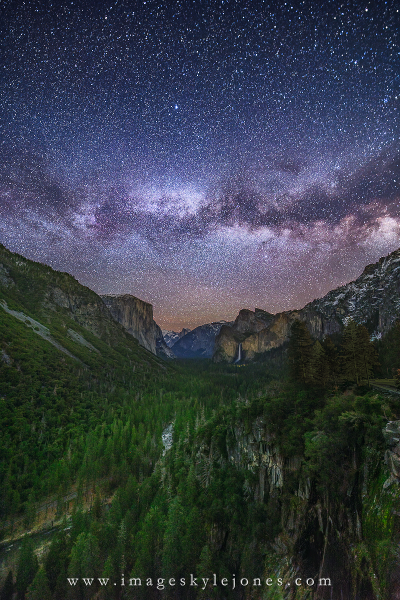
This is a follow-up from my recent post from Tunnel View. For this one I grabbed my 14mm lens and attempted a portrait shot. I've always liked how the river leads into the scene from this location, even though the horizontal band of stars tends to stop the visual flow.

Any thoughts are welcome!

2030 Stars Over Yosemite Portrait_1200.jpg


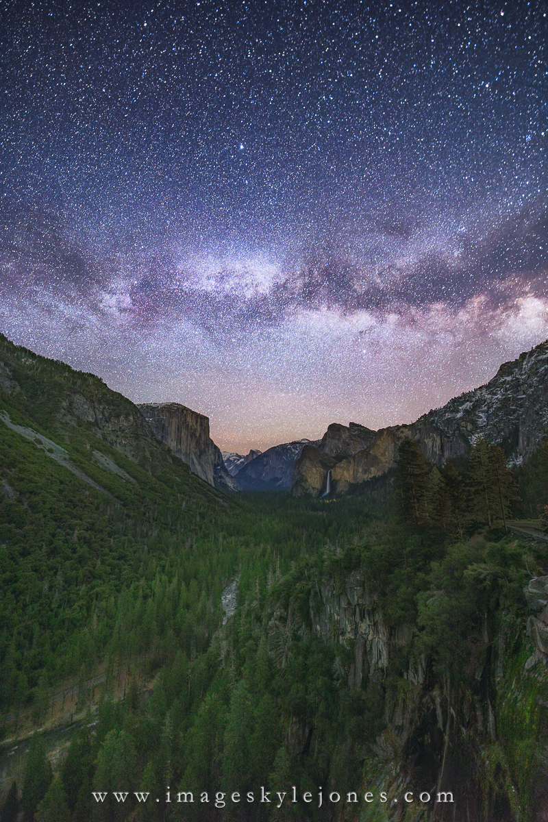
Updated based on feedback to darken the sky and add some contrast into the ground layer.

2030 Stars Over Yosemite Portrait_1200.jpg
 
Last edited:

JimFox

Moderator
Staff member
Hey Kyle, I like the Portrait view. I would suggest 2 things. Pull down the Highlights in the sky as the Milky Way is coming across as blown out. And then add contrast or clarity to the ground, it needs some black in the shadows.
 

AlanLichty

Moderator
I somehow missed this one but it looks pretty nice. I do have to agree with Jim about maybe pulling down the highlights in the sky a bit.
 

Kyle Jones

Moderator
Thank you all for the feedback. I'm glad the composition has promise. I have some ideas for processing that I'll play with.
 

Kyle Jones

Moderator
Hey Kyle, I like the Portrait view. I would suggest 2 things. Pull down the Highlights in the sky as the Milky Way is coming across as blown out. And then add contrast or clarity to the ground, it needs some black in the shadows.
I really like the composition with its bi-directional emphasis. I think it would work better with a darker sky.
I somehow missed this one but it looks pretty nice. I do have to agree with Jim about maybe pulling down the highlights in the sky a bit.
New image added. Let me know what you think.
 

AlanLichty

Moderator
Nice edits - much better detail down in the forests in the valley as well as up in the sky. I like the additional contrast and deeper blacks.
 

JimFox

Moderator
Staff member
Very nice Kyle. You addressed both of my thoughts on this. I think I may like this more then the horizontal image.
 

Michael13

Moderator
I like the darker sky much better. It feels more like night to me.

But the foreground appears too contrasty to me, does not feel like night.

I really feel it all comes down to personal preference when showing nightscape images. Some people prefer to blend in daytime foregrounds for better contrast and detail, and I find that these images get a lot of positive reviews on forums like this, but, to me, lose the feeling of being made during nighttime. No right or wrong - it's what do you prefer. And seemingly contradictory to that - I prefer a detailed sky with more stars, but we all know that to the naked eye, the sky appears much darker and the stars more feint. To sum it up, I lean towards fake skies and more realistic foregrounds for night photos. But that's just me.

Thanks for making this thread Kyle - good discussion on a topic I think of often.

Finally, if this were my image, I would go with the darker sky from the second image, the lower contrast foreground in the first (maybe just a teeny bit more contrast) and I'd crop it. I think a square crop would work because the slight bow in the MW compliments the shape of the valley. It's a great photo!
 

MonikaC

Well-Known Member
I like the darker sky. I agree with Michael13 in that the foreground doesn't look like a night image.
Beautiful image overall!
 
Top Bottom