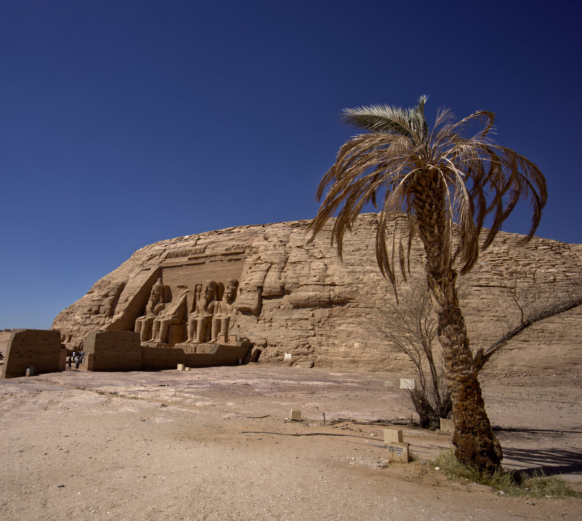
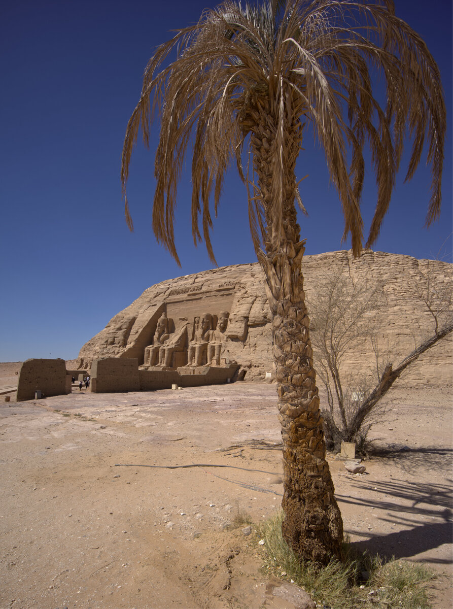
#2 for my eyes. I like the portrait orientation and how you filled the frame with the palm and kept it in focus along with a good depth of field for the temple in the background. The first one has a bit too much empty sky and doesn't feel like quite as balanced a composition.
I also like #2 as the portrait orientation works better with the main subject is the palm tree. A minor nit for #2 is that the top of the tree is cut out.
How interesting. For me, it's #1, with the same thought as Kyle. And then I read the comments and saw Alan and Jameel picked #1. To me, it's clear it's #1, but it shows both images here are pretty strong and will appeal to different people.
There is an issue with Uploading Photos (attachjments). I am not sure what the problem is, and I am looking into it. You can still try to Create your Threads and Upload your Photos, but it is hanging up during the Upload.