Field daisies + Edit

Amy Earl

Well-Known Member
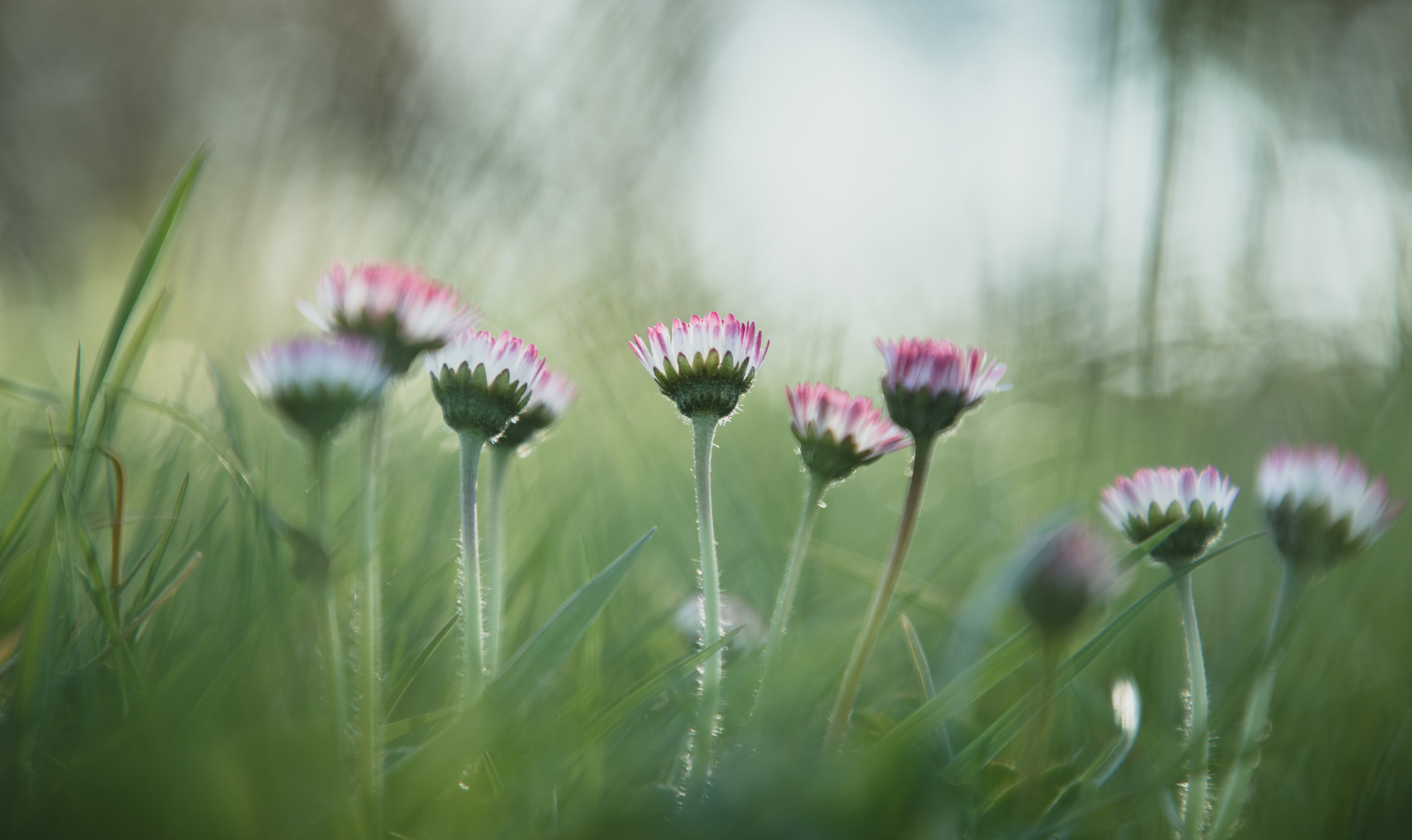
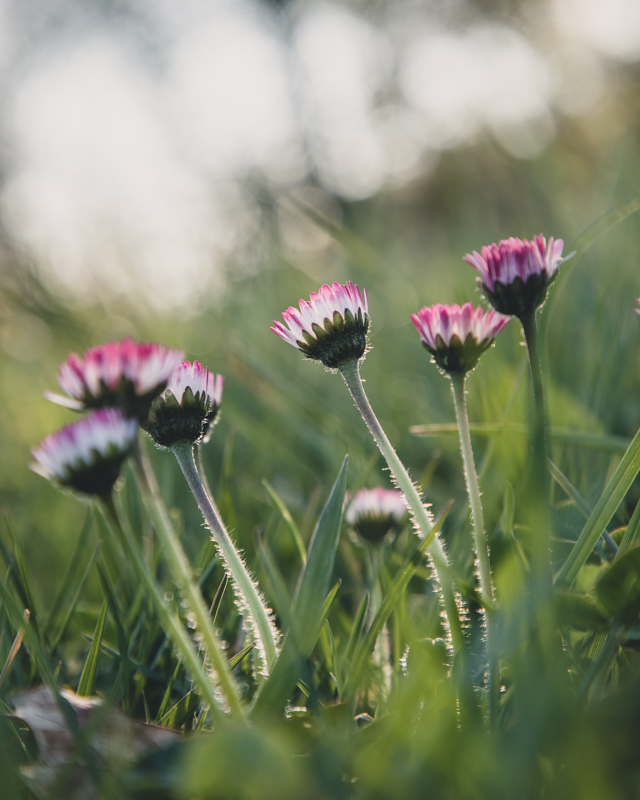
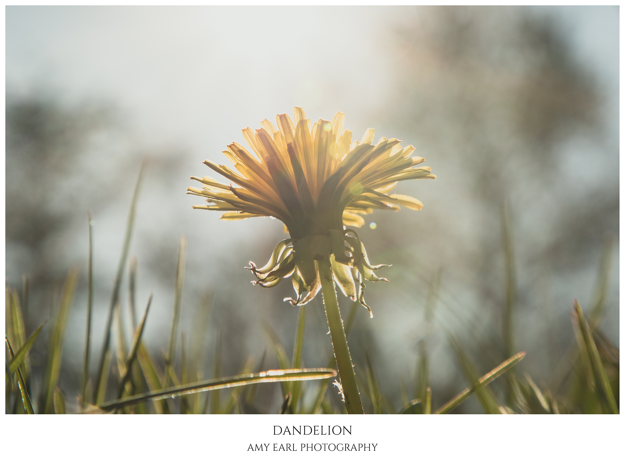
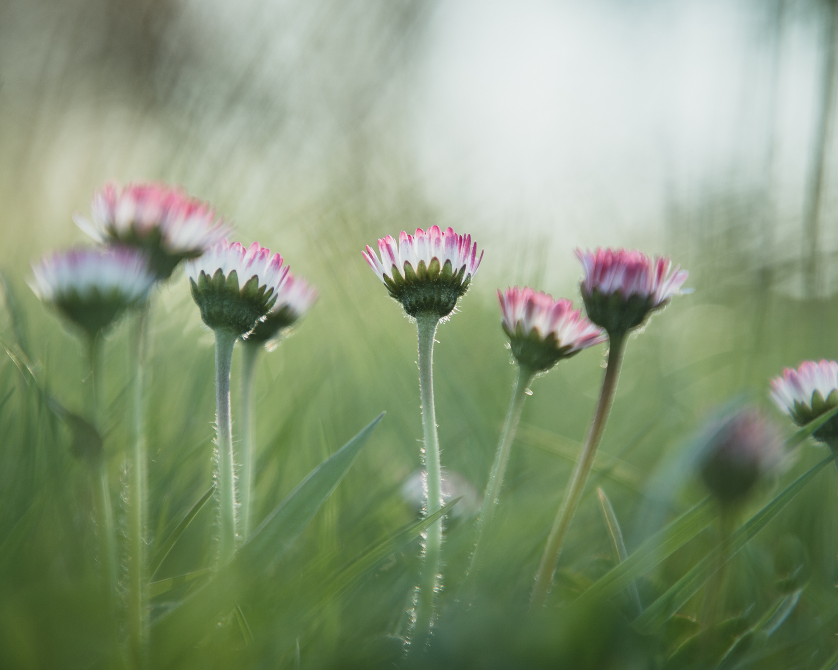
Here are a few flower photos from one of my afternoon walks. C&C welcome.

#1


#2


#3


#4 - Experimenting with backlighting (for this one I held the daisy head over the sun). I added some grain for texture during processing, felt like it added to the pseudo-polaroid style.


Jameel Hyder

Moderator
Staff member
A nice set Amy. The last and the first one for me in that order. Perhaps a crop of the first one to lose that blade of grass on the left side.
 
Here are a few flower photos from one of my afternoon walks. C&C welcome.

#1


#2


#3


#4 - Experimenting with backlighting (for this one I held the daisy head over the sun). I added some grain for texture during processing, felt like it added to the pseudo-polaroid style.

Beautiful set, Amy. I really like what you have done with the DOF. Congratulations on the Daily Featured Post.
 

Terry Farrow

Well-Known Member

Amy Earl

Well-Known Member
Thanks so much, everyone :)

I'm surprised to hear that many of you liked #4 - it wasn't my favorite but your response makes me want to see if I can improve on it a bit or try similar photos, perhaps with other flowers.

Congrats on the Daily Featured Post Amy!

@Amy Earl
Thanks so much, Jim!

A nice set Amy. The last and the first one for me in that order. Perhaps a crop of the first one to lose that blade of grass on the left side.
Great suggestion, thanks!
 

JimFox

Moderator
Staff member
One more thing I like about these is the pastel feel to them. Some very nice soft colors.
 

Amy Earl

Well-Known Member
I tried a tip I got from a video this morning on cinematic techniques. There seems to be a lot of blue hue in film color grading. I also found after 3 years on Instagram that blue-hued photos seem to attract more likes. In lieu of that info I tried this in Photoshop on this photo: Added a solid color fill layer, picked a vivid medium blue, and set it to Exclusion blend mode with opacity at 20%. What do you think of this effect? I find these tones appealing.

 
Last edited:

Eric Gofreed

Well-Known Member

AlanLichty

Moderator
I tried a tip I got from a video this morning on cinematic techniques. There seems to be a lot of blue hue in film color grading. I also found after 3 years on Instagram that blue-hued photos seem to attract more likes. In lieu of that info I tried this in Photoshop on this photo: Added a solid color fill layer, picked a vivid medium blue, and set it to Exclusion blend mode with opacity at 20%. What do you think of this effect? I find these tones appealing.
This processing leaves kind of a dreamy look to the scene that works well for this subject. Not sure I would run out and apply this to everything but it does work here.
 
Top Bottom