Arbusigny Sunrise II

Amy Earl

Well-Known Member
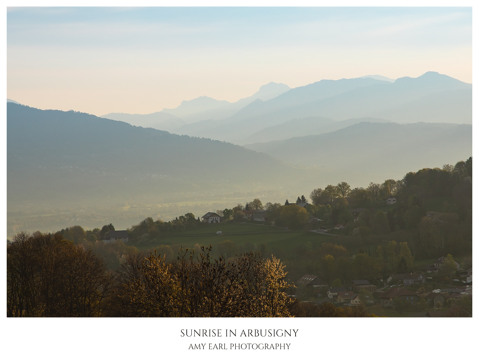
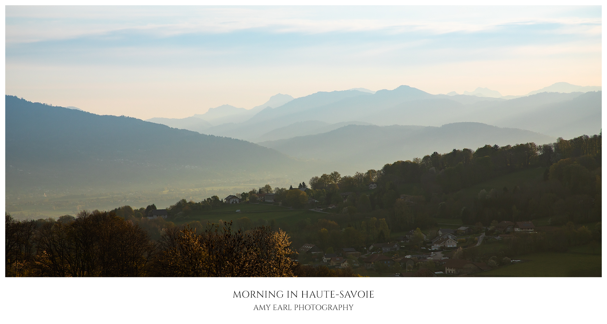
Here's another shot from pretty much the same vantage point as the one in my recent Arbusigny Sunrise post, just taken a little later in the morning on my way back from my walk.


I really like the shapes of the distant hills enveloped in morning mist. It almost feels like the colors generally need to pop more or something but that's probably because direct sunlight had not yet reached the hill in the middle-foreground and so this whole area remains a bit dark. The lighting is difficult to work in processing but I wanted to stay true to the scene at that hour. I was pleased that sunlight was hitting the top of the tree down there in front, as it helps convey the angle of the sun.

C&C welcome.
 

JimFox

Moderator
Staff member
I think the lighting feels real in this and portrays that angle of it. It's a pretty nice layered scene. The darker hill in this case kind of hides the village below so that it doesn't become a distraction.

I would experiment with one crop, sometimes with crops I don't know if they are an improvement until I try them. But in the sky, I would crop off that very top layer of clouds. I think letting the lower clouds/mist the gradiate up to that blue sky makes for a stronger background then the blue being a window in the clouds if that makes sense. But I would need to see it to know for sure. :)
 

Ben Egbert

Forum Helper
Staff member
This one has lots of depth because of the receding layers. I think the lighting is appropriate to the scene.
 

AlanLichty

Moderator
The layers make the shot. I have to agree with Ben that the lighting feels just about right considering time of day.
 

Amy Earl

Well-Known Member
I think the lighting feels real in this and portrays that angle of it. It's a pretty nice layered scene. The darker hill in this case kind of hides the village below so that it doesn't become a distraction.

I would experiment with one crop, sometimes with crops I don't know if they are an improvement until I try them. But in the sky, I would crop off that very top layer of clouds. I think letting the lower clouds/mist the gradiate up to that blue sky makes for a stronger background then the blue being a window in the clouds if that makes sense. But I would need to see it to know for sure. :)
This one has lots of depth because of the receding layers. I think the lighting is appropriate to the scene.
The layers make the shot. I have to agree with Ben that the lighting feels just about right considering time of day.
Thanks for all your kind words. I will definitely try out that crop, Jim. I see what you're going for with that idea. That would also let me try zooming in more on those layered hills. Will report back soon :)
 

Jim Dockery

Well-Known Member
I prefer the crop and processing. Being able to see the buildings draws me in more and gives a sense of place, then I look further and see more layers in the valley. Thanks to your nice larger gallery version I can get the same feel from the first one, but when looking at the smaller one on this page it is mostly about the mountain layers, the edit fits the title better.
 

Amy Earl

Well-Known Member
I prefer the crop and processing. Being able to see the buildings draws me in more and gives a sense of place, then I look further and see more layers in the valley. Thanks to your nice larger gallery version I can get the same feel from the first one, but when looking at the smaller one on this page it is mostly about the mountain layers, the edit fits the title better.
Thanks!

Now that I've lightened the foreground a little, it all feels a little bit pastelly or lacking contrast, maybe I could dehaze and/or draw out those mountain layers a little more. What do you think?
 

Amy Earl

Well-Known Member
Hm, yes, I feel the new version lacks something nice in the original edit (though I like the new crop). The shadowed foreground in the original allowed the mountains to pop out more, and then that spot of sunlight on the tree in the foreground added a nice highlight to accent the light falling in the valley in the background. I'm missing this contrast I think...
 

Jim Dockery

Well-Known Member
Amy, for sure the edit is all about the haze, which can be a good thing, lending it a painterly quiet morning feel. Try some de-haze or clarity and see what you think. Using PS I would do it in ACR with an adjustment brush.
 

Luvwine

Well-Known Member
I like the edited version better too. I might try a bit of dehaze (I try never to use more than 10 points—usually less tho I have used more rarely). This will also tend to darken the sky which may make the next suggestion superfluous. I might experiment with a slight GND filter to see if you could add a bit more blue at the top, and see if you like it. Again, just ideas and my hurt more than help.
 

Amy Earl

Well-Known Member
Amy, for sure the edit is all about the haze, which can be a good thing, lending it a painterly quiet morning feel. Try some de-haze or clarity and see what you think. Using PS I would do it in ACR with an adjustment brush.
I like the edited version better too. I might try a bit of dehaze (I try never to use more than 10 points—usually less tho I have used more rarely). This will also tend to darken the sky which may make the next suggestion superfluous. I might experiment with a slight GND filter to see if you could add a bit more blue at the top, and see if you like it. Again, just ideas and my hurt more than help.
Thanks for your suggestions guys, I'm gonna play around with it and will report back here :)
 

MonikaC

Well-Known Member
I like the processing in the edited version, but prefer the pano-type crop, maybe losing some of the top layer of clouds like Jim F suggested. I think it lends more of a feeling of space & quiet.
 

Jameel Hyder

Moderator
Staff member
I like the edit crop and processing - a stronger foreground to go with the nice hazy layers in the distance.
 
Top Bottom