Douglas Sherman
Staff
I 'm not a B&W guy so I need your input for these two images which will hang on my son's wall. Any and all comments are welcome.
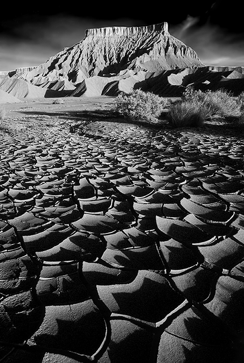
Doug, the first photo: B&W Factory Butte is superb, I love the strong contrast.I 'm not a B&W guy so I need your input for these two images which will hang on my son's wall. Any and all comments are welcome.
View attachment 71104
View attachment 71106
 )
)Both are just wow !I 'm not a B&W guy so I need your input for these two images which will hang on my son's wall. Any and all comments are welcome.
View attachment 71104
View attachment 71106