2 'Takes' - Another 'Rescued' Image form the Archives + EDIT

Mike Lewis

Staff Member
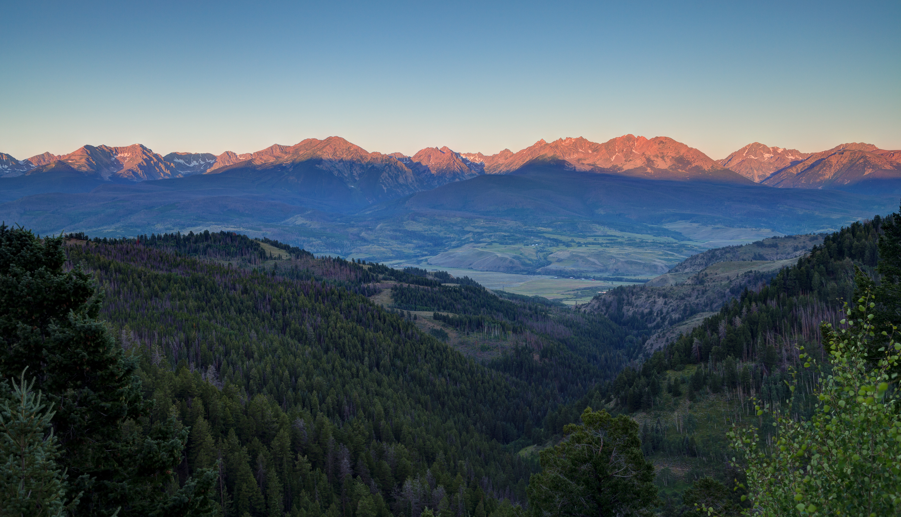
So was looking for an image the other day and happened across one from the same shoot, just minutes earlier. I dimly recall there was some reason I didn't favor this 'found' image the first time around, but now I cannot really see why. Perhaps someone here can point out the issue(s) with it.

These are both from a sunrise trip to Highway 9 near Frisco CO, when we were staying in town the night before. The sunrise shot is the one posted on my website, but it is the pre-sunrise version that caught my eye this time around. Something about that 'Belt of Venus coloring that is always very striking and frequently manages to rescue a shot with an otherwise uninteresting cloudless sky.

Here is the newly rediscovered pre-sunrise shot:


LRCC_sRGB_FW_GoreRangePreSunrise_IMG_0771_2_3-2.jpg


And here is the sunrise shot:

LRCC_sRGB_FW_GoreRangeSunrise_sRGB_IMG_0799_800_801_fuN.jpg


Which is preferred? See anything with the 'new' image that is problematic?

ML
 
Last edited by a moderator:

AlanLichty

Moderator
I like the first one as well - I am a serious fan of blue hour light and go out of my way to shoot in it. The whole color palette has magical feel to it and you can actually see more of the scene because the light is more uniform with the predawn light.
 

JimFox

Moderator
Staff member
The first one is the best one Mike.

The only issue I see is in both of them and that would be the out of focus tree in the lower right. Getting that into focus would have improved both. And also since you couldn't avoid that tree it appears, you could select the leaves on that tree to darken them slightly since they are the brightest green in the image, the eye will get attracted to it.

Looking at these a bit more. I think a crop where you avoid both the trees in the lower left and then the one on the right would improve both.
 

Ken Rennie

Well-Known Member
Hi Mike. I also prefer the first image. However on first seeing them side by side on my phone I was struck by the increased contrast and perhaps too much clarity of the bottom half of the image. On its own it doesn't seem too high in contrast but I am left wondering if you decreased the bottom half contrast and clarity a touch whether it would raise your eyes towards that lovely soft skyline. The pre-dawn shot should naturally have less contrast or it should in my eyes. Just my 2c worth. Ken
 

Jim Dockery

Well-Known Member
#1 for me. I'm with Jim on the trees in the corners drawing the eye. His crop idea might work well, I would also darken the whole bottom 2/3. It looks like you used a GND filter on the top, which worked well to control the sky and bring out the belt of Venus, but now the mountains look too dark in relation to the lower area.
 

Mike Lewis

Staff Member
OK very good comments everyone. I will play a bit with the cropping and the foreground tree colors and see if I can fashion something to post. I will also look at Ken's comments to see what I might want to experiment with there too.

ML
 

Mike Lewis

Staff Member
Here is an edit that minimizes the brightness of the left tree a little bit, hopefully not in a way that is too heavy handed (local adjustments are not something I have a lot of experience at really...)

LRCC_sRGB_FW_GoreRangePreSunrise_Edit1_IMG_0771_2_3-2.jpg


ML
 
Top Bottom