Choose the best processing

Vote for you favorite version

  • #1

    Votes: 2 50.0%
  • #2

    Votes: 2 50.0%

  • Total voters
    4

Ben Egbert

Forum Helper
Staff member
I was practicing using my camera after cataract surgery.. After 77 years a nearsighted guy who could read fine print sans glasses, now I can't see anything up close without readers. But I can tell you my far vision is much improved. I also see better contrast and more saturation and do better on color vision tests.

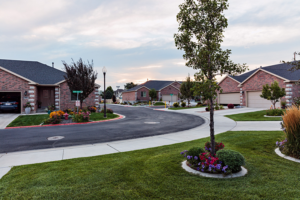
So I took a picture from my front porch and processed it my old way and then what looks good to my new vision.

I want a vote on which you prefer without saying which was which.

#1
180726-7324-5DS R NO GAMA.jpg


#2
180726-7324-5DS R.jpg
 

AlanLichty

Moderator
For my eyes (not saying much) #2 seems like it shows more details than the first version. The leaves in the trees both near and far as well as the street sign seem softer for detail/focus.
 

JimFox

Moderator
Staff member
Hey Ben, I voted for #2 but I am viewing this on my iPhone so I won’t be able to tell critical detail. In reality from what I saw both versions are acceptable. The midtones were probably just a slight bit darker in #2 and it’s just a hair saturated more. But I would say the difference is maybe 5% more and still totally acceptable.
 

Ben Egbert

Forum Helper
Staff member
Thanks for the participation here, much appreciated. I agree, at web size they look pretty similar. At home, and on a 4K wide gamut monitor they differences are more apparent. The main difference is that the old processing has more shadow highlight, haze and clarity and a touch of gamut applied. Otherwise they are the same.

What prompted this was that when I first did this one using my normal steps, it looked gritty to me at full screen and slightly over saturated. Even though the saturation adjustments were the same on both, the gamma step tends to enhance saturation.
 

Ben Egbert

Forum Helper
Staff member
Thanks all for the replies. The new processing is #1. I guess it may be too subtle at web size to see the difference because it's mostly contrast and clarity on #2 which at full sizes makes it a bit grittier. Its especially noticeable in the grass.
 
Top Bottom