Dave Johnston
Well-Known Member
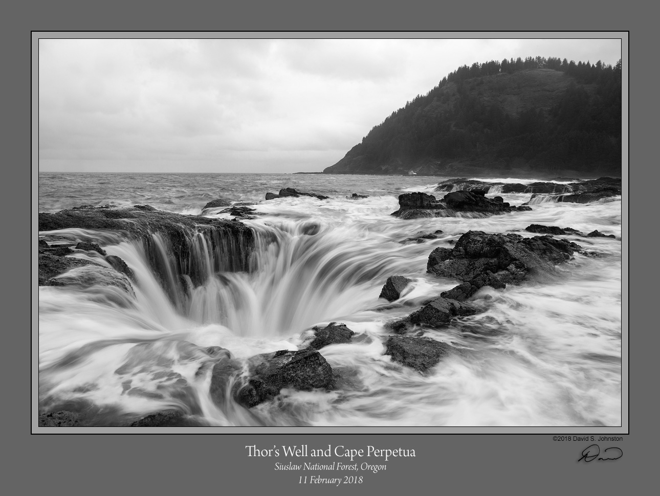
Last month I had an opportunity to spend a few days on the Oregon coast. Though I had been there before I decided to go some places I hadn't seen previously. The first of those was Thor's Well near Cape Perpetua. The classic view of this are with a colorful sunset in the background. Well, the moderately high tide needed to fill the well didn't happen at sunset, and it was a socked-in rainy day anyway. I was just going to spend a couple hours and then move on, but I ended up spending most of the day exploring the intertidal rocks between Thor's well and Cape Perpetua. Not sure what will come out of all that, but anyway here is the first, of the Well itself. Any preference for color vs. B&W?
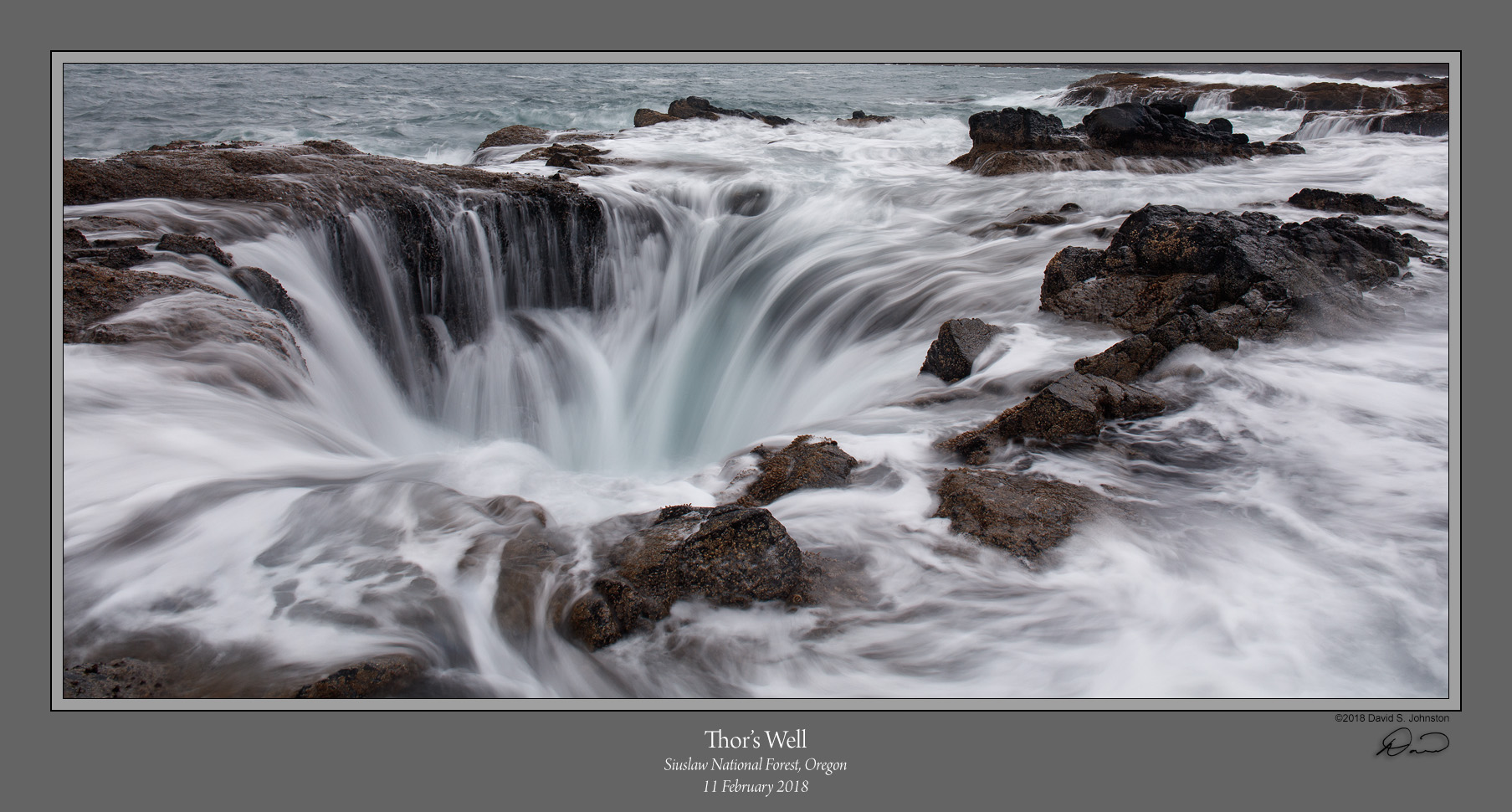
Edit: Several people were uninspired by the sky and hill in the background, and asked if I had a closer shot of just the Well. The hill is Cape Perpetua, and I had thought that the curve of it formed kind of a ying-yang with a complementary curve of the Well, but maybe that was too obscure! At any rate, I didn't take closer shot, but I can certainly crop for just the Well. I do rather like this. Thanks for the suggestions!
Comments and suggestions are always welcome!
Dave
Last edited: