Thoughts on this Moonrise Please
- Thread starter Brian
- Start date

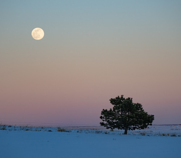
This sure looks really great Brian! You have detail in the moon, and just the right amount of darkness in the scene.
Everything is centered, which normally is a no no. But in a scene with just the 2 elements, it works. I would have shot this like this, but I also would have shot one more composition, and that would be to move the tree a little more to the right in the frame, probably in the right third, and then have the moon moved to the upper left corner more. And then back at the computer I would have looked at both to see which version was more compelling.
Your instincts worked well here, and I do really like it, but for giggles I would have tried the other composition I described just to make sure.
Brian
Well-Known Member
This sure looks really great Brian! You have detail in the moon, and just the right amount of darkness in the scene.
Everything is centered, which normally is a no no. But in a scene with just the 2 elements, it works. I would have shot this like this, but I also would have shot one more composition, and that would be to move the tree a little more to the right in the frame, probably in the right third, and then have the moon moved to the upper left corner more. And then back at the computer I would have looked at both to see which version was more compelling.
Your instincts worked well here, and I do really like it, but for giggles I would have tried the other composition I described just to make sure.
You mean like this?
")

Ha ha Brian! I like your thinking. I will look at both again tomorrow after I wake up with a clearer head.You mean like this?
the horizon appears tilted clockwise - the first image has it aligned nicely. Fixing it will make it stronger however. The tree and the moon are positioned nicely.You mean like this?
I like your first image as well.
Very nice. I prefer the second one.
I also shot the moon last night, but we have mountains that delayed the shot by 1/2 hour and of course this made everything dark accept the moon. Now for a tough blend job
I also shot the moon last night, but we have mountains that delayed the shot by 1/2 hour and of course this made everything dark accept the moon. Now for a tough blend job
AlanLichty
Moderator
I like the composition in the second image but the first one is the one I keep looking at. The second image with the lower point of view has a more busy feel to it with the fence posts sticking above the horizon and the lights of the dwellings in the backdrop. There also seems to be a lot of empty space in the comp that could be trimmed out. A suggested crop for the second one and cloning out some posts and lights:
That's a quick but dirty hack from your jpeg that would benefit from more careful edits on the original but it gives an idea for framing the scene.
That's a quick but dirty hack from your jpeg that would benefit from more careful edits on the original but it gives an idea for framing the scene.
Hey Brian,
Well I am finally getting to look back at this, though it's after midnight, so watch out...
I do still really really really like your original shot. That just works.
But with that said, I do like Alan's crop. He must have read my mind as that's what I had pictured as an alternative. Is it better? Not really sure but it does work. I often like to see have more then one view of a location or subject. It doesn't always have to be that one is better then the other. I would like to see a work up on the crop that Alan presented where maybe you warmed up the moon just a tad.
So which do you like best? (there is no wrong answer) I don't know if you see it, but I definitely have seen your photography grow and improve over the 2 or 3 years you have been here at FocalWorld!
Brian
Well-Known Member
Hey Brian,
Well I am finally getting to look back at this, though it's after midnight, so watch out...
I do still really really really like your original shot. That just works.
But with that said, I do like Alan's crop. He must have read my mind as that's what I had pictured as an alternative. Is it better? Not really sure but it does work. I often like to see have more then one view of a location or subject. It doesn't always have to be that one is better then the other. I would like to see a work up on the crop that Alan presented where maybe you warmed up the moon just a tad.
So which do you like best? (there is no wrong answer) I don't know if you see it, but I definitely have seen your photography grow and improve over the 2 or 3 years you have been here at FocalWorld!
Thank you for the kind words. I really appreciate it. I definitely like the first one. I think this is why I struggle with composition. I wouldn't even have thought to post the second one. I can see how it follows the rule of thirds, but I just don't like it near as much. If I had to edit it again, I would clean it up quite a bit. Get rid of some of the distracting bushes and what not.
I really do appreciate everyone's thoughts. I may work on it a bit more. But hey, not bad considering it was taken in my front yard.