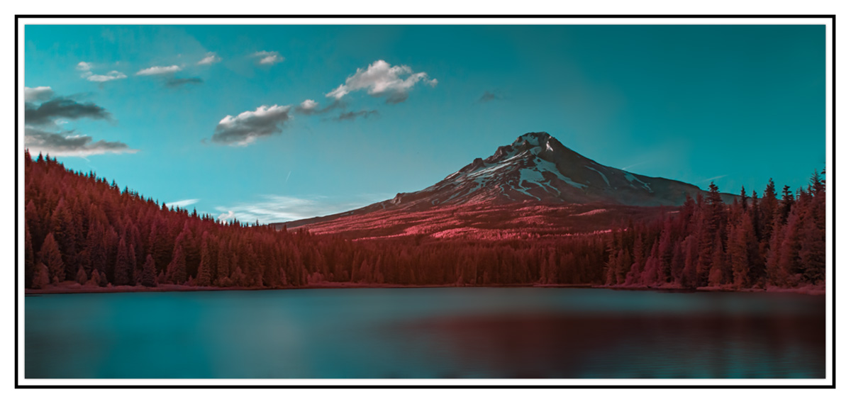
An image I hadn't processed till recently since I never quite likeD the color palette with my IR processing. So decided to play a bit to see I can make it work. What do you think?
C&C Welcome
C&C Welcome
") I like the result of the long shutter open with the satin water textures.
I like the result of the long shutter open with the satin water textures.Thanks BenWorks for me.
Thanks Alan. I struggled with the palette. Good to know it wasn't way out of left field.Not the usual color palette but the one thing with IR is the simple reality that there aren't any rules for what you do with it
Thanks Jim. This is 590nm as well.What NM is this Jameel?
With my 590nm, if I don't add any artistic adjustments to it, mine look like this, or similar to it. The orange in this is a bit more red then mine, but it's cool what you came up with.
Jim, I struggle with the color rendition in IR to my liking as well. There are definitely subjects and processing techniques which yield very interesting effects with IR. In any case, here is a B&W version.I honestly don't get the fascination with color IR. I can't think of any that have been posted here that make me want to try it. I'd like to see what this looks like in B&W.
thanks Craig.Very Nice Jameel, I really like the color version much better.
That's the neat thing about IR , the Possibilities are unlimited and the
different wavelengths bring such different perspectives than can be seen with a "Normal" camera ;-)
Take Care, Be Safe, and Well,
Craig
thanks Amy.I much prefer the color version, it showcases the beauty of the water in relation to the rest of the scene so much better. Great Job!