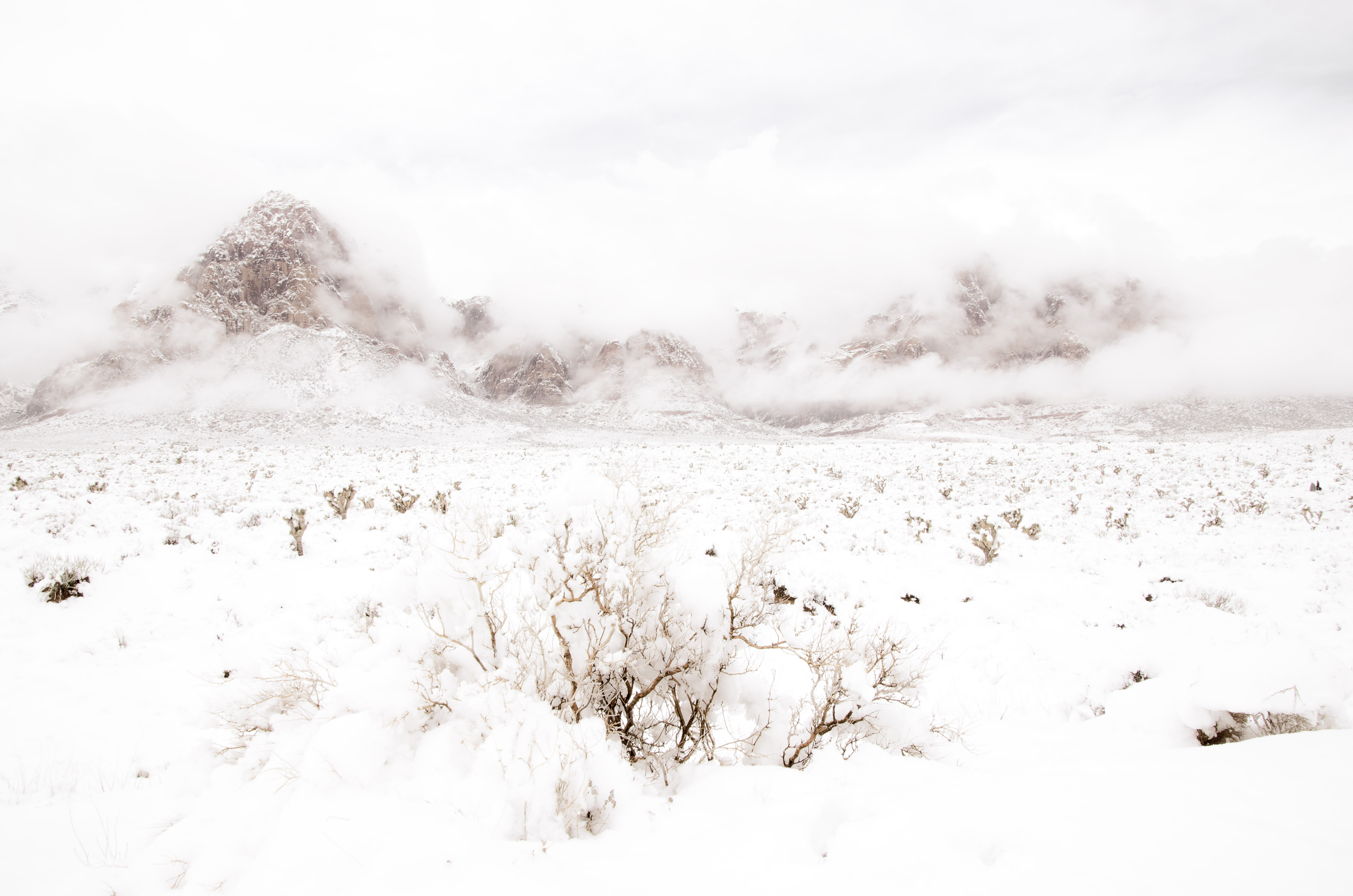
What could I do to improve this?

Ben Egbert

Forum Helper
Staff member
Gee Darcy, you need to show us a poorer example;)

But if you just want to jazz it up, how about putting up a raw or DNG? I am sure we could add contrast. The question would be it that would enhance it?
 

Darcy Grizzle

Well-Known Member
Gee Darcy, you need to show us a poorer example;)

But if you just want to jazz it up, how about putting up a raw or DNG? I am sure we could add contrast. The question would be it that would enhance it?
Well I put it in Nevada Photographers on FB & no-one commented, got a lot of likes but it made me think it is not up to par ya know? I thought I did pretty well with it but I don't know hahahaha, made me second think.
 

Ben Egbert

Forum Helper
Staff member
I know just what you mean, I feel that way too. Why not put up a raw or DNG and let people take a stab at it.
 

Kyle Jones

Moderator
Do you use Lightroom or Adobe RAW? One easy way to get some pop is to go to the curve in the develop module and drag the lights slider to the right. You can pull the whites back to the left a little to prevent the highlights from blowing out.
 

Ken Rennie

Well-Known Member
Darcy this is a stunner. I saw it on my phone earlier today and thought monochrome and add a "little" oomph to the hills and sky. I am now looking on my laptop and have had a play with this jpeg. All I have done is hit the black and white button and added a grad with dehaze and a little lightening of shadows to keep the sky light. Using the luminosity slider darkening blues drags the eye up into the sky and lightening it calms the sky down. Altering the orange slider allows you to make the mountains pop or not. Oh I would love to play with a RAW file but the jpeg is lovely. Doing the same in colour works but you need to desaturate the blues or the dehaze makes them too strong. I will not post unless you ask. Of course this is my take and may only appeal to me. Ken
 

Darcy Grizzle

Well-Known Member
Darcy this is a stunner. I saw it on my phone earlier today and thought monochrome and add a "little" oomph to the hills and sky. I am now looking on my laptop and have had a play with this jpeg. All I have done is hit the black and white button and added a grad with dehaze and a little lightening of shadows to keep the sky light. Using the luminosity slider darkening blues drags the eye up into the sky and lightening it calms the sky down. Altering the orange slider allows you to make the mountains pop or not. Oh I would love to play with a RAW file but the jpeg is lovely. Doing the same in colour works but you need to desaturate the blues or the dehaze makes them too strong. I will not post unless you ask. Of course this is my take and may only appeal to me. Ken
Oh go ahead & post :), I would love to see it! I may try to replicate your work. I could email you the raw if you like unless someone can tell me how to put the raw in here.
 

JimFox

Moderator
Staff member
Oh go ahead & post :), I would love to see it! I may try to replicate your work. I could email you the raw if you like unless someone can tell me how to put the raw in here.
Hey Darcy, look up at the top of the forum, Ben has the instructions written out on how to upload a Raw (DNG). :)
 

JimFox

Moderator
Staff member
I was out in Joshua Tree, I will play with this later also Darcy. It's a cool shot with lot's of potential.
 

Kyle Jones

Moderator
I took a pass at it. To me it is all a matter of taste - I really like the soft light and dreamy atmosphere of the original. But if you did want to punch things up, here's an example:
1) Added a hue/saturation layer and added saturation to the blues and darkened them a little. I used a hand-painted mask to apply this just to the blue parts of the sky
2) I added another hue/saturation layer adding some saturation to the reds. I hand painted a mask to apply this just to the mountains.
3) I added some mid-tone contrast to the mountains and sky (I selected the midtones using a luminance mask and increased the contrast a little with a curve). If you don't have luminance masks, you can skip this
4) I selected the light tones (you can ctrl-click on the RGP channel to select the light tones) and used an s-curve to add contrast. I felt like that added the most interesting "pop" in this one.

I'm happy to share more detail about any of these adjustments if you like.


DSC_6479-Kyle.jpg
 

Darcy Grizzle

Well-Known Member
I took a pass at it. To me it is all a matter of taste - I really like the soft light and dreamy atmosphere of the original. But if you did want to punch things up, here's an example:
1) Added a hue/saturation layer and added saturation to the blues and darkened them a little. I used a hand-painted mask to apply this just to the blue parts of the sky
2) I added another hue/saturation layer adding some saturation to the reds. I hand painted a mask to apply this just to the mountains.
3) I added some mid-tone contrast to the mountains and sky (I selected the midtones using a luminance mask and increased the contrast a little with a curve). If you don't have luminance masks, you can skip this
4) I selected the light tones (you can ctrl-click on the RGP channel to select the light tones) and used an s-curve to add contrast. I felt like that added the most interesting "pop" in this one.

I'm happy to share more detail about any of these adjustments if you like.


View attachment 16462
Well that made the mountains pop :). but now the blue sky seems to draw my eyes away from the rest of the picture :). The whites look fantastic though!
 

Ken Rennie

Well-Known Member
Here is my colour version, I think that it retains most of the softness of the original but I have tried to put a little more emphasis on the background and the bush in the foreground as I think that the midground is the wekest part of the image. I would probably have tried to get lower to try and compress th midground or indeed remove it entirely. Mono to follow Ken
DSC_6479-3-1 colour.jpg
 

Ken Rennie

Well-Known Member
This is my mono rendering. I have introduced some banding in the snow, very visible bottom right I have also tried to remove the size of the midground by using content aware move. with a RAW file I think that all of the visible artifacts would go. I have also tried to put more emphasis on the foreground bush to introduce depth. Ken
DSC_6479-3-1 mono.jpg
 

Ben Egbert

Forum Helper
Staff member
Darcy, just got home, sorry for the late reply, but it looks like you got some really good advice. Next time you have trouble uploading a DNG, just email it to me.

Here is my take. I opened it in ACR and ran auto which added lots of pep to it, not the least was an exposure reduction of 1

I then did my normal stuff in Topaz, which I realize is not available if you don't have Topaz, but I like it. I ran exposure adjust and color/contrast boost. I then added 10% each haze and clarity.

DSC_6479-3 ben.jpg
 

Darcy Grizzle

Well-Known Member
Do you use Lightroom or Adobe RAW? One easy way to get some pop is to go to the curve in the develop module and drag the lights slider to the right. You can pull the whites back to the left a little to prevent the highlights from blowing out.
Lightroom. I will go back & play some more :).
 
Top Bottom