Russian Ridge

Timmeh

Well-Known Member
Last edited:

AlanLichty

Moderator
All three are fun shots but I find the first one a more compelling comp. The second one contains most of the elements of the first but almost feels like its trying to cover too much and leaves my eyes wandering around instead of being pulled up into the neat light on the distant ridges. The first one is very effective at grabbing my attention and pulling me into the scene.

The B&W is an interesting shot but suffers from being in the same post as the first two :)
 

Timmeh

Well-Known Member
Whoops I accidentally deleted part of the necessary text for including image #3. :oops:

Thanks for the comments Alan. I had higher hopes for the lone flower (#2), but I didn't want to trample grass/get a tick to get a better composition.

Tim
 

AlanLichty

Moderator
The second shot with the flower is a strong one but feels like the is a struggle between the subject down in front and the openers of the scene behind. As I look at that one and ignore the rest maybe a trim on the top to remove the open sky above the clouds? As I scroll the image down to clip off the blue sky with my web browser the lack of open sky gives this a very different mood and makes the sharp flower work better.

I like the new #3.
 

JimFox

Moderator
Staff member
Russian Ridge is such a cool location!

My favorite is #1, I want to like #2, that lone flower is cool. The dead grass does distract from it. I could that cropping some off the bottom helped it a bit.

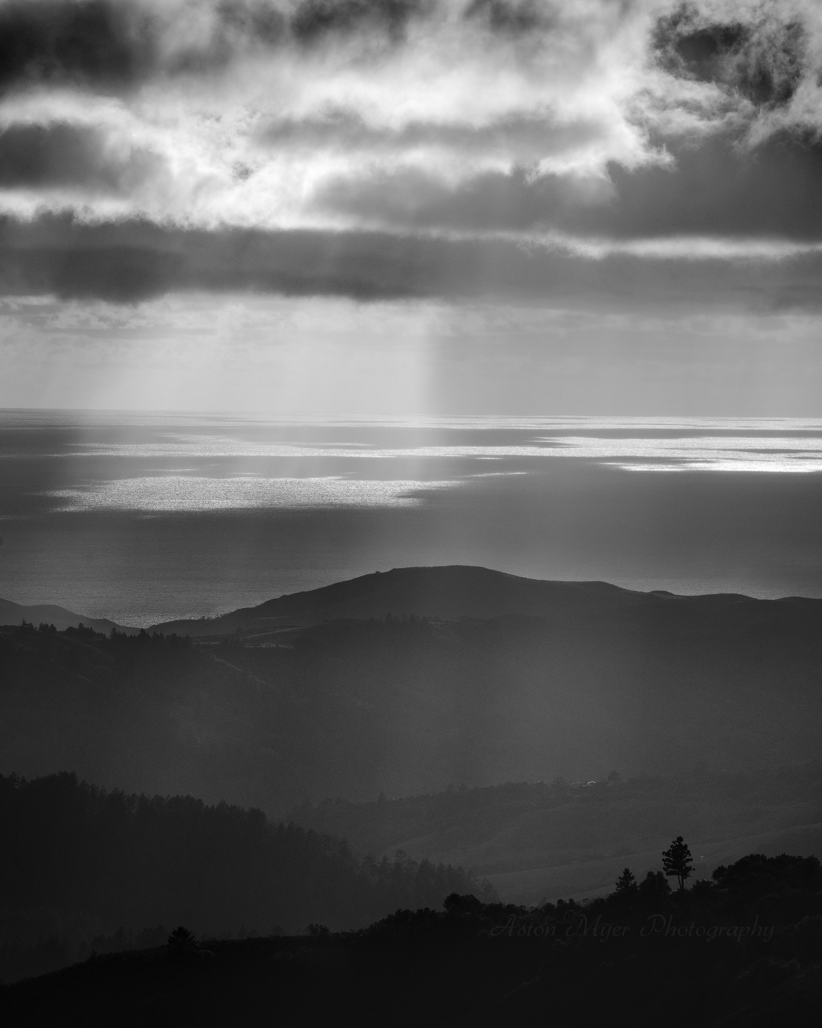
#4 is also growing on me. I think cropping off the top to bisect that dark thin cloud just above the sun rays really strengthens it I think.
 

Timmeh

Well-Known Member
Thanks for commenting everyone (and Jeffrey for being suitably blunt). I wanted to like #3, but my wife rejected it and told me there was too much cloud. Maybe I like clouds too much for my own good.

Tim
 

Jim Dockery

Well-Known Member
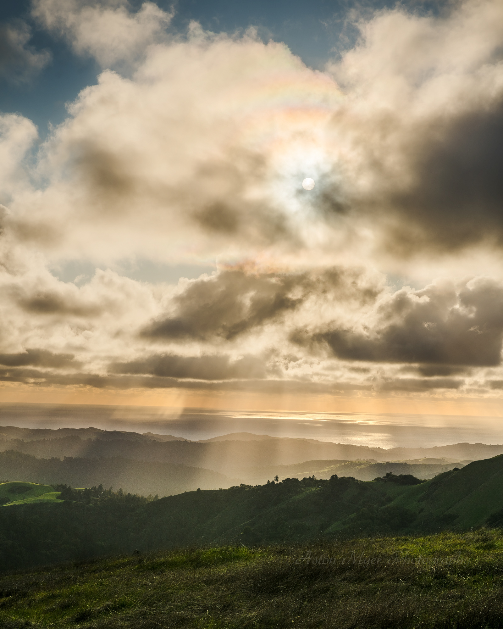
I'll go against the grain and side with you on #3. I love the clouds, sun, and hint of rainbow - now you just need the appropriate bible verse to make a religious greeting card. The last one also strikes me as almost abstract - the shimmering water looks like it could be incredible flat clouds catching the light.
 

Amy Earl

Well-Known Member
#3 for me too for the same reasons as you and Jim - I love sun and clouds. The sunrays shining down on that very interesting and busy distant horizon are what adds the real wow factor and anchor point for the magnificent sky. Topping it all off is the vibrant green grass at the bottom. I'm not religious but this is really like the image we have of Paradise with its blend of blue sky, sea, green hills, warm sunrays -- and a rainbow!

That said, #1 is a strong contender for first place. It's a strong composition and better than #2 because you've drawn focus to the sunrays with the deeper contrast and the darker foreground - the eye is naturally led to the lighter area of the image.

#2 - I totally agree with Alan's crop suggestion. I think either cropping some off the bottom or the top can work (one or the other but not both). In other words, lose the blue sky but keep the flower, or lose the flower and keep the sky. I think I would prefer the latter, and in that case it might even be better than #1 because the clouds are more interesting (especially those little golden ones off to the right). But for this to truly contend with #1 you would also need to darken the foreground a little and enrich the golden rays like you did for #1.

#4 - I love this image, it's a great composition and works so well in b&w. The lone tree in the lower right perfectly complements the pool of light and sunrays on the upper left. I agree with Jim's crop suggestion now that I consider it - that would definitely improve this comp!
 

Terry Farrow

Well-Known Member
Trying to teach remotely is...interesting. To decompress I took a walk at Russian Ridge with some good spotlighting. I'm feeling indecisive at the moment, so here are four. All comments welcome!

Tim

#1 Looking Down on Creation

#2 Unfashionably Early

#3 Veiled and Bare

#4 Center stage
Beautiful set of images #2 is my favourite.
 
Trying to teach remotely is...interesting. To decompress I took a walk at Russian Ridge with some good spotlighting. I'm feeling indecisive at the moment, so here are four. All comments welcome!

Tim

#1 Looking Down on Creation

#2 Unfashionably Early

#3 Veiled and Bare

#4 Center stage
This is a nice series. I really like #1, Tim. It is simple and beautiful.
 
Top Bottom